
Part 2 of MLB Org Assessment Case Study
57 Hitters
Across Multiple Levels
Mar 30, 2024
Part 2 of MLB Org Assessment Case Study looks at how uHIT Assessment metrics track on-field performance in-season
What you need to know from Part 2:
Most process metrics and some outcome metrics tracked with the uHIT Assessment. We explain why.
Part 1 and Part 2 Overview
Part 1 (see more here) showed how much information about a hitter’s approach you can get from the 15-min uHIT Assessment. In Part 2 of MLB org assessment case study, we analyze how metrics from the 15-minute assessment tracked to a whole season of hitting performance.
A Note on Names and Time Per Player (Part 1)
In Part 1, we described info we had upfront on hitters’ identities. The 57 hitters who did the uHIT Assessment were all unknown to us. All we know is that they were selected from multiple levels of our MLB org client. As a result, any of the hitters could have been from DSL, AZL, Low A, High A, AA, AAA, or even the MLB club. All we knew about their on-field performance came from process and outcome metrics collected during the rest of 2016. Some examples of these metrics are Out-of-Zone Take Rate or Ball Rate.
What the uHIT Assessment Showed Us About 57 Org Hitters (Part 1)
The Pitch Recognition and Zone Recognition components of the uHIT Assessment summarize a hitter’s skills in this areas. In Part 1, we examined the average results across all hitters to see what biases they have in their hitting approach (see more here). Do they prioritize a “yes” or a “no” decision on average? We also examine trends to see which of the two portions of the assessment (Pitch or Zone skills) has a better chance of reliably relating to what a hitter does on-field.
Verifying The Org’s Provided Data (Part 1)
We wrapped up Part 1 by delving into the data provided by the MLB org. Is it internally consistent? Are metric definitions clear and do they make sense as a whole? It is common today when working with an MLB to verify impact with on-field performance data. In this case, we were provided with anonymized process metrics (derived from Trackman Baseball and manual input). We had no way to verify this data with publicly available data because the hitters’ identities were hidden. But we described in Part 1 (see more here) how we decided which metrics were verified, and which possibly errant.
How uHIT Assessment Tracked On-Field Results (Part 2)
To kick off Part 2 of MLB org assessment case study, we will summarize how both the Pitch Recognition and Zone Recognition components of the uHIT Assessment summarized each hitters’ skills. From there, we will show how these metrics tracked with season-long hitting metrics of each of the anonymous hitters. We will see that the results are noisy. Remember, this is a 15-minute assessment of hitting approach compared to a full season of on-field hitting performance. But the trends are clear and we will walk you through them, particularly focusing on the pitch selection aspects of these hitters.
Noise Factors: 15-Minute Assessment, Anonymous Season Results and Pitch Recognition Difficulties (Part 2)
To close out Part 2 of MLB org assessment case study, we describe below some of the factors that make the uHIT Assessment incomplete. Why is that important? Since 2016 when this case study occurred, we have learned that the uHIT Assessment is only a starting point for improving hitting approach. We will talk about how each of these hitters’ 15-minute assessments could have been a jumping off point to address the problems we saw back then. In this section, we will also address the downsides of the hitters’ identities being hidden from us. Lastly, we will comment on the difficulty of the old Zone Recognition portion of the uHIT Assessment. We will then highlight the changes made to it so we get a better measurement of this skill.
How uHIT Assessment Tracked On-Field Results:
Pitch Recognition Portion
How Out-of-Zone Decisions On-Field Tracked in Assessment:
Take Rates
Across the board, we found that decisions for out-of-zone pitches were best tracked in the Pitch Recognition side of the 15-minute uHIT Assessment. Below, we dive into these details and suggest why that may be so in this part 2 of MLB org assessment case study.
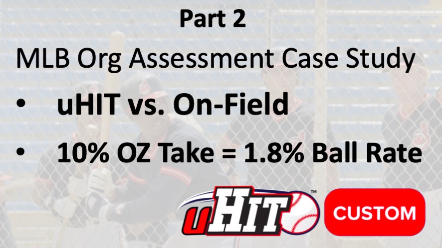
First, we guessed that the Out-of-Zone Take Rate on-field would have a positive relationship to the equivalent metric in uHIT. For the Pitch Recognition portion of the assessment, these pitches are not “out-of-zone” per se. But instead they are pitches the hitter should say “no” to, just like a hitter generally should do for pitches out of the zone (see here for examples of “no” decisions in evaluating pitch recognition skills). In neuroscience research, we call this ability “inhibitory control” (see more here) and it’s the same skill for saying no to pitch out of the zone or to a pitch you’re not looking for.
To examine the relationship between these two measures, we plot Out-of-Zone Take Rate from uHIT vs. On-Field here:
Graph Analysis
There are a few points to understand from this graph:
- The data is noisy. In other words, there is not a perfect straight line. But we expect this, given factors described above and explained more below.
- There is a positive relationship: As the hitter’s Out-of-Zone Take Rate goes up in uHIT, it goes up on-field too.
- The slope of this relationship is 0.3157 for these 57 hitters’ data. This means that every 10% of Out-of-Zone Take Rate measured in the uHIT Assessment amounted to 3.157% Out-of-Zone Take Rate on-field.
Data Analysis
In statistics, the Pearson or Spearman coefficients are calculations for determining how much of a relationship exists between two sets of data (see more here). If the value is +1 for either coefficient then there is a strong positive relationship. If the value is -1 then there is a strong negative relationship. In this case, the Pearson is 0.36 and the Spearman is 0.27. This confirms what we see visually above. There is somewhat of a positive trend between Out-of-Zone Take Rate measured in the 15-minute uHIT Assessment and in the full 2016 season on-field for these 57 hitters.
How Out-of-Zone Decisions On-Field Tracked in Assessment:
Swing Rates
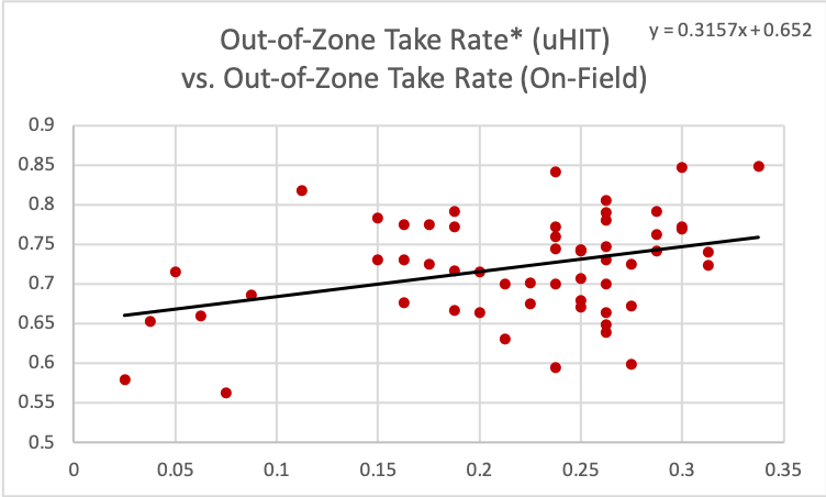
Second, we guessed that the Out-of-Zone Swing Rate on-field would also have a positive relationship to the equivalent metric in uHIT. We use the same logic about “inhibitory control” (see more here) described above, here for decisions to say “yes” instead of decisions to say “no” to a pitch. It’s the same skill for saying yes to a pitch out of the zone or to a pitch you’re not looking for.
To examine the relationship between these two measures in part 2 of MLB org assessment case study, we plot Out-of-Zone Swing Rate from uHIT vs. On-Field here:
Graph Analysis
There are a few points to understand from this graph:
- The data again is noisy. In other words, there is not a perfect straight line. But we expect this, given factors described above and explained more below.
- There is a positive relationship: As the hitter’s Out-of-Zone Swing Rate goes up in uHIT, it goes up on-field too.
- The slope of this relationship is 0.2436 for these 57 hitters’ data. This means that every 10% of Out-of-Zone Swing Rate measured in the uHIT Assessment amounted to 2.436% Out-of-Zone Swing Rate on-field.
Data Analysis
We use the Pearson or Spearman coefficients (see more here) again to grade the strength of this relationship. In this case, the Pearson is 0.29 and the Spearman is 0.22. This confirms what we see visually above. There is somewhat of a positive trend between Out-of-Zone Swing Rate measured in the 15-minute uHIT Assessment and in the full 2016 season on-field for these 57 hitters. This trend is not as strong as the relationship for Out-of-Zone Take Rate.
How Ball Rates On-Field Are Tracked in Assessment
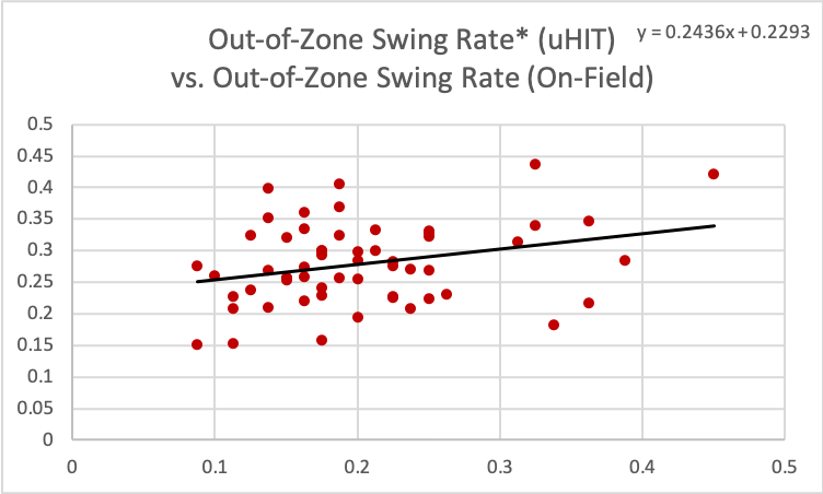
Lastly, we guessed that the Ball Rate on-field would have a positive relationship to the Out-of-Zone Take Rate in uHIT. We come to this estimate because of the positive relationship we verified above between Out-of-Zone Take Rate and Ball Rate on-field. From that plot, we see a noisy relationship too. We expect a positive relationship between Ball Rate On-Field and the Out-of-Zone Take Rate in uHIT. But we expect it to be weaker than the Out-of-Zone Take Rates relationship between uHIT and on-field.
To examine the relationship between these two measures, we plot Out-of-Zone Take Rate from uHIT vs. Ball Rate On-Field here:
Graph Analysis
There are a few points to understand from this graph:
- The data is noisier than both plots above. But we expect this, given factors described above (detailed in Part 1) and explained more below.
- There is a positive relationship: As the hitter’s Out-of-Zone Take Rate goes up in uHIT, the hitter’s Ball Rate on-field goes up too.
- The slope of this relationship is 0.1798 for these 57 hitters’ data. This means that every 10% of Out-of-Zone Take Rate measured in the uHIT Assessment amounted to 1.798% Ball Rate on-field.
Data Analysis
We use the Pearson or Spearman coefficients (see more here) again to grade the strength of this relationship. In this case, the Pearson is 0.35 and the Spearman is 0.38. This confirms what we see visually above. There is somewhat of a positive trend between Out-of-Zone Take Rate measured in the 15-minute uHIT Assessment and the Ball Rate in the full 2016 season on-field for these 57 hitters. The relationship is slightly stronger (via the Pearson/Spearman coefficients), but the relationship is not as positive (via the slope) as the above process metrics relationships.
How uHIT Assessment Tracked On-Field Results:
Zone Recognition Portion
How Out-of-Zone Decisions On-Field Tracked in Assessment:
Take Rates
We found similar relationships from the Zone Recognition portion of the uHIT Assessment. Here, we will summarize those findings, as they are quite similar to those presented above from the Pitch Recognition portion (contact us here to see more details). Together, they complete what we found in this MLB org assessment case study.
As above, we guessed that the Out-of-Zone Take Rate on-field would have a positive relationship to the equivalent metric in uHIT. For the Zone Recognition portion of the assessment, these pitches are truly “out-of-zone.” So they are a more intuitive analog to pitches the hitter should say “no” to (see here for examples of “no” decisions in evaluating zone recognition skills). Here, the ability for “inhibitory control” (see more here) is the skill for saying no to pitch out of the zone.
To examine the relationship between these two measures, we plot Out-of-Zone Take Rate from uHIT vs. On-Field here:
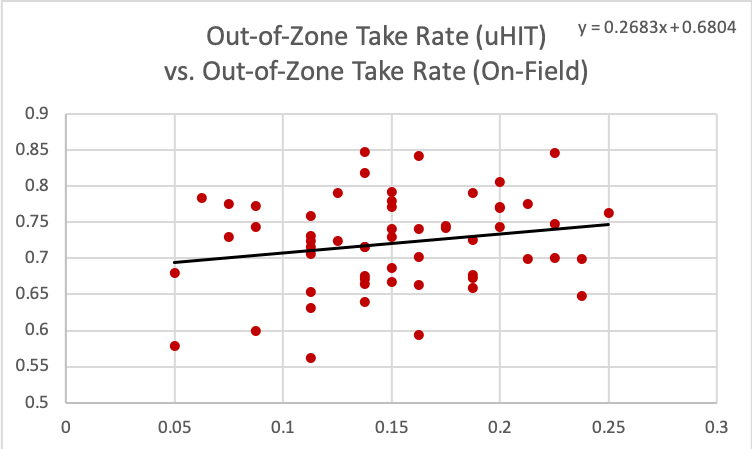
Graph / Data Analysis
There are a few points to understand from this graph, and to contrast it with the analog from the Pitch Recognition portion earlier:
- The data is noisy and even more so than for the Pitch Recognition analog. But we expect this added noise because of the increased difficulty on-average for the Zone Recognition part of the assessment
- There is still a positive relationship: As the hitter’s Out-of-Zone Take Rate goes up in uHIT, it goes up on-field too.
- The slope of this relationship is 0.2683 for these 57 hitters’ data. This means that every 10% of Out-of-Zone Take Rate measured in the uHIT Assessment amounted to 2.683% Out-of-Zone Take Rate on-field.
Again, we use the Pearson and Spearman coefficients to determine how much of a relationship exists between two sets of data (see more here). In this case, the Pearson is 0.20 and the Spearman is 0.16. This confirms what we see visually above. There is somewhat of a positive trend between Out-of-Zone Take Rate measured in the 15-minute uHIT Assessment and in the full 2016 season on-field for these 57 hitters. But it is a weaker relationship from the old version of the Zone Recognition portion of the assessment than for the Pitch Recognition portion.
How Out-of-Zone Decisions On-Field Tracked in Assessment:
Swing Rates
Again, we guessed that the Out-of-Zone Swing Rate on-field would also have a positive relationship to the equivalent metric in uHIT. Here, the logic about “inhibitory control” (see more here) is again more intuitive for decisions to say “yes” to. It’s the same skill for saying yes to a pitch in the zone.
To examine the relationship between these two measures, we can plot Out-of-Zone Swing Rate from uHIT vs. On-Field (contact us to see it). Instead, we jump to the correlation and regression results next.
Graph / Data Analysis Substitute
From the graph, we would see:
- The data again is noisy.
- There is a positive relationship: As the hitter’s Out-of-Zone Swing Rate goes up in uHIT, it goes up on-field too.
- The slope of this relationship is 0.2038 for these 57 hitters’ data. This means that every 10% of Out-of-Zone Swing Rate measured in the uHIT Assessment amounted to 2.038% Out-of-Zone Swing Rate on-field.
We use the Pearson and Spearman coefficients (see more here) again to grade the strength of this relationship. In this case, the Pearson is 0.18 and the Spearman is 0.14. This confirms what we see visually above. There is somewhat of a positive trend between Out-of-Zone Swing Rate measured in the 15-minute uHIT Assessment and in the full 2016 season on-field for these 57 hitters. This trend is not as strong as the relationship for Out-of-Zone Swing Rate found with the Pitch Recognition portion of the assessment.
How Ball Rates On-Field Tracked in Assessment
Lastly, we again guessed that the Ball Rate on-field would have a positive relationship to the Out-of-Zone Take Rate in uHIT. We come to this estimate because of the positive relationship we verified above between Out-of-Zone Take Rate and Ball Rate on-field. Again, we expect the relationship between Ball Rate and Out-of-Zone Take Rate in uHIT to be weaker than the Out-of-Zone Take Rates relationship between uHIT and on-field.
To examine the relationship between these two measures, we can plot Out-of-Zone Take Rate from uHIT vs. Ball Rate On-Field again. Instead, we proceed to the correlation coefficient calculations next.
Graph / Data Analysis Substitute
From the graph, we would see:
- The data is noisier than the Out-of-Zone analogs. But we expect this too, given factors described above (and in Part 1) and explained more below.
- There is a positive relationship: As the hitter’s Out-of-Zone Take Rate goes up in uHIT, the hitter’s Ball Rate on-field goes up too.
- The slope of this relationship is 0.1883 for these 57 hitters’ data. This means that every 10% of Out-of-Zone Take Rate measured in the uHIT Assessment amounted to 1.883% Ball Rate on-field.
We use the Pearson and Spearman coefficients (see more here) again to grade the strength of this relationship. In this case, the Pearson is 0.24 and the Spearman is 0.25. This confirms what we see visually above. There is somewhat of a positive trend between Out-of-Zone Take Rate measured in the 15-minute uHIT Assessment and the Ball Rate in the full 2016 season on-field for these 57 hitters. The relationship is weaker (via the Pearson/Spearman coefficients) than we found from the Pitch Recognition portion. But the relationship is slightly more positive (via the slope) than it was for the Pitch Recognition portion of the assessment.
Noise Factors: 15-Minute Assessment, Anonymous Season Results and Zone Recognition Difficulties
Below, we look at the factors that add noise. In other words, we examine the factors that make a 15-minute assessment only a starting point for understanding (and improving) a hitter’s approach. In order, we will examine:
- The pros and cons to assessing a hitter’s approach in just 15 minutes
- How anonymizing hitters for this study (an org decision) actually hindered our ability to connect our measurements to a key outcome metric (Strike Rate)
- The noisiness of the performance data from the Zone Recognition portion of the uHIT Assessment (try it here). We discuss then how this portion of the assessment is changed in response to this study and others like it due to this finding.
15-Minute Assessment Pros/Cons
In this MLB org assessment case study, we found positive relationships between metrics on-field and their equivalents in uHIT. As the graphs showed though, they were weak correlations. One large source of this weakness is the fact that we used a 15-minute assessment to tell us about a 7-month season. No one-time test is going to tell us the future ever. But a major pro to doing the assessment this way is that it was fast and allowed us to get a sense of almost half the hitters in this org. And the uHIT Assessment has been used in other evaluation settings as a station for the same function (see more here). The con of course is that it’s only a snapshot. As we describe below, that’s why the uHIT Assessment is usually the starting point for training with uHIT Custom (see more).
Anonymous Season Results
Another source of noise here is the anonymity of the hitters involved. We knew this going into this MLB org assessment case study. We understand the org’s scientific approach here in terms of not tempting us to fudge the numbers so they match on-field data. But in the end, not knowing hitter identities kept us from looking at outcome measures, like OPS and strikeout-to-walk ratios. Of course, Out-of-Zone Swing Rate and Out-of-Zone Take Rate should be analogs or have some relation to these outcomes. But in the case of Strike Rate, we had to abandon that metric because it didn’t make sense against the rest of the dataset it came from. Perhaps if we’d had on-field outcomes from hitter identities, we’d have been able to see a relationship to a strike/strikeout-based metric.
Zone Recognition Difficulties
Finally, there is one source of noise in this 2016 MLB org assessments case study that does not exist anymore. And that is the difficulty of the Zone Recognition portion of the assessment. In 2016, we used two MLB pitchers whose WAR value (see here) was ~0. We thought these would be average pitchers initially and that they would not be too easy or too hard. But as we worked with more DSL, AZL, and other MiLB hitters, we started seeing that the pitches were very hard. Even for some MLB hitters, not having the context of the count and situation made the task extra difficult. For instance, Adam Engel told us this when he was with the White Sox.
We took this feedback and analyzed data like this look at 57 hitters. We came to the conclusion that we needed to dial down the speeds and pitch selection of the Zone Recognition portion of the uHIT Assessment (read more about the current speeds and pitch types here). This is one way that the MLB org assessment case study was valuable for many years afterwards. Since then, we’ve expanded the assessment so that it fits youth, high school, college and pro hitters. This gives each group a range of pitch speeds and types that are appropriate to their general level of play. From there, the uHIT Custom algorithm adjusts the difficulty to gradually challenge a hitter’s zone skills. This approach has proven remarkably effective, as many case studies of ours have shown (see college and pro examples, along with a full list here).
I sincerely enjoyed what you’ve accomplished here. The sketch is fashionable, your written content chic, yet you appear to have developed some apprehension regarding what you aim to offer thereafter. Certainly, I shall return more frequently, just as I have been doing almost constantly, should you uphold this upswing.
This website is an absolute gem! The content is incredibly well-researched, engaging, and valuable. I particularly enjoyed the [specific section] which provided unique insights I haven’t found elsewhere. Keep up the amazing work!
I’ve been visiting this site for years, and it never fails to impress me with its fresh perspectives and wealth of knowledge. The attention to detail and commitment to quality is evident. This is a true asset for anyone seeking to learn and grow.
Thank you for your response! I’m grateful for your willingness to engage in discussions. If there’s anything specific you’d like to explore or if you have any questions, please feel free to share them. Whether it’s about emerging trends in technology, recent breakthroughs in science, intriguing literary analyses, or any other topic, I’m here to assist you. Just let me know how I can be of help, and I’ll do my best to provide valuable insights and information!
This website has quickly become my go-to source for [topic]. The content is consistently top-notch, covering diverse angles with clarity and expertise. I’m constantly recommending it to colleagues and friends. Keep inspiring us!
I’m grateful. I have spent a long time looking for information on this subject, and yours is the greatest I have come across so far. However, what about the revenue? Are you positive about the source?
[…] underscore the importance of statistics in developing a player’s game and the potential for data-driven strategies to produce superior on-field […]